The Logo
This version of the logo contains the extra text for Donohue, Iowa. This is the preferred logo to use wherever possible. The logo may be set in any of the approved brand colors.
If a smaller logo becomes necessary, use the secondary logo. This will avoid the problem of readability for the subtitle.
For media and packaging that require a square logo, use this circle log.
Logo Usage Rules
Spacing
The logo uses the sizing of the uppercase letter “F” as a guide for spacing around elements. Do not allow any other items to intrude this space
Avoid these logo adjustments
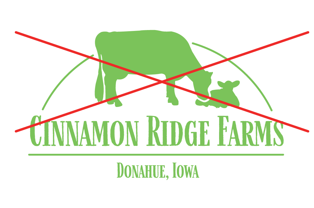
Do not set the logo in unapproved colors outside the brand color scheme.
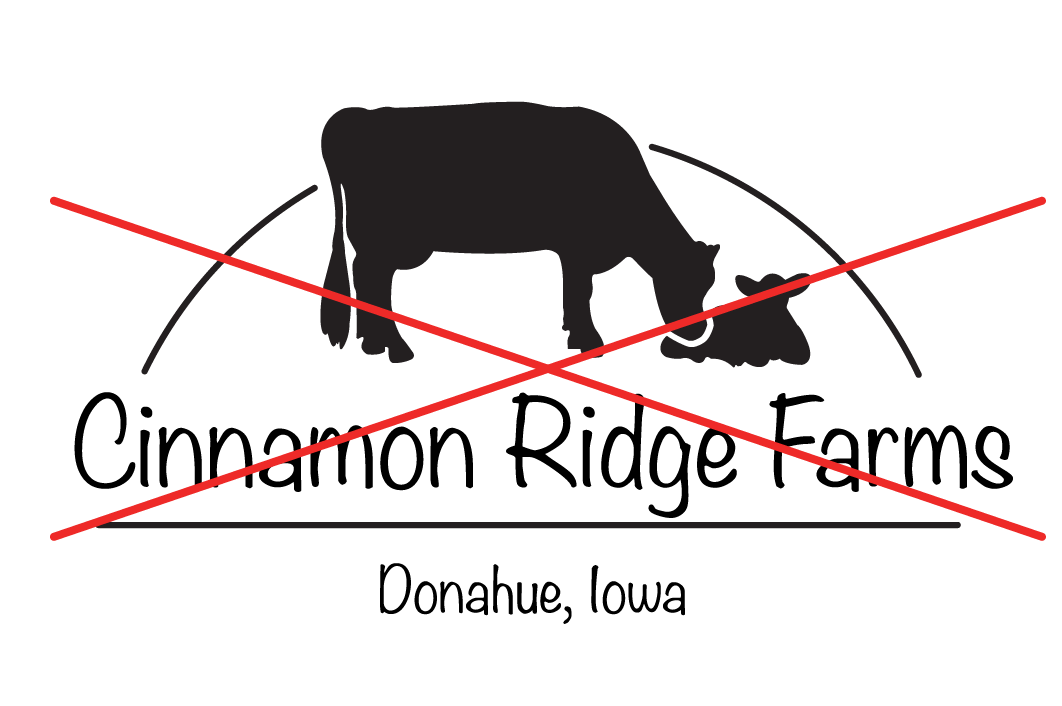
Do not set the logo text in a different typeface. Only use Farmhand.
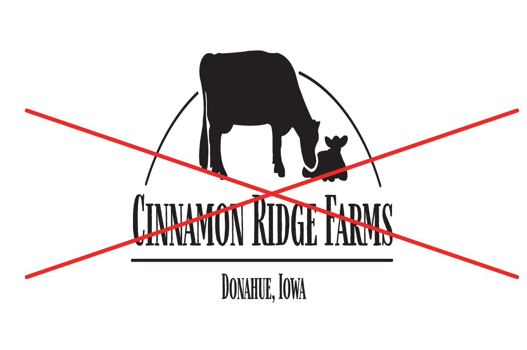
Do not skew the logo. Preserve the image ratio when resizing.
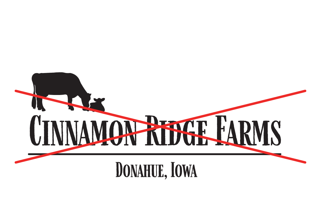
Do not reposition graphics in the logo.
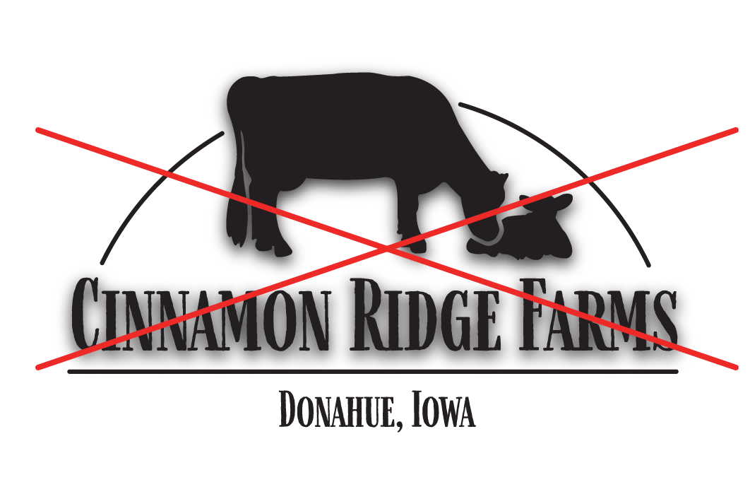
Do not add stylistic effects such as drop shadows.
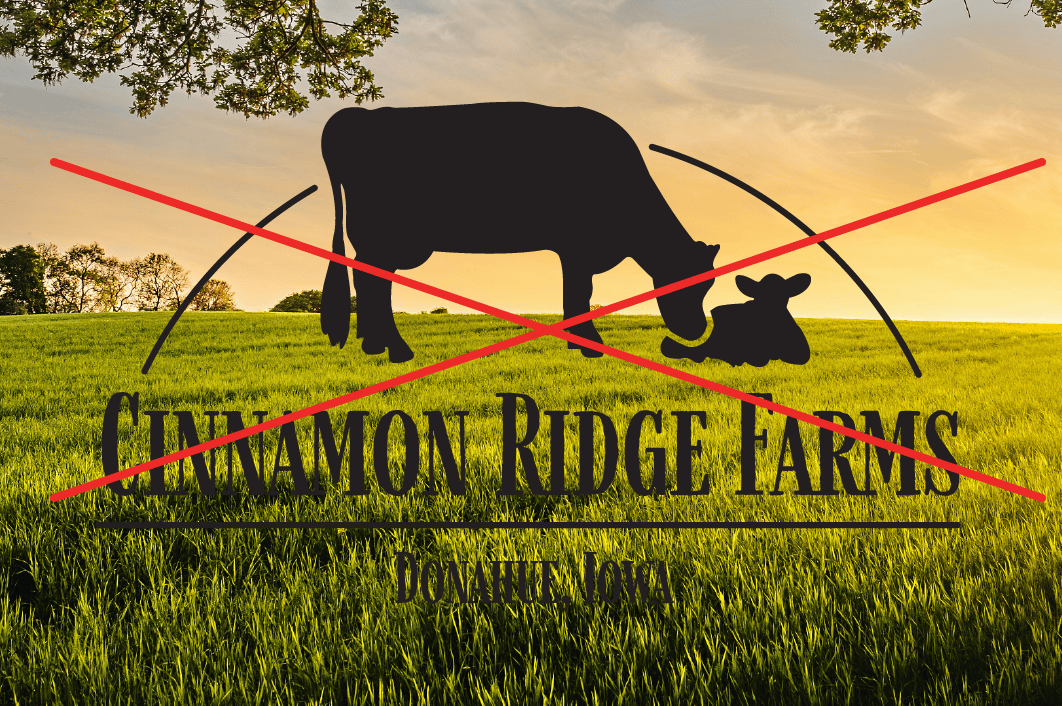
Do not place the dark version of the logo on top of busy backgrounds.